6 Tips to Improve your Landscape Photography Compositions
At the heart of every good landscape photograph is a well thought out composition. Composition can make or break any image. It is an art unto itself that can come naturally, or be learned and mastered by any aspiring photographer. In this article I am going to give you 6 tips on how you can improve your compositions to create better landscape photographs.
1. Introduce Leading Lines

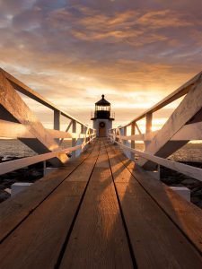
A great composition will lead the viewer’s eyes through the image, and leading lines are a perfect and visually pleasing way of accomplishing this. The best part about leading lines is that you can use almost anything to create them. A quiet meandering trail, the gentle S curve of a tranquil river, or the intriguing striations of a worn rock — there are no limitations on what you can use as leading lines. Your only goal is to lead the viewer to where you want their eyes to go as they “walk” through your image.
2. Consider the Composition
Where the elements are located in your composition is important to consider. When creating a landscape photograph, your goal is to arrange everything you want to include in your image in an orderly fashion. At the same time, consider if every element that you have included in the image is actually necessary. If something is simply cluttering the composition and serves no purpose to your final vision, remove that element. You don’t want to include every aspect of a scene into the composition if it will potentially take the viewer’s focus from the main elements you want them to see.
3. Separation of Elements
It is very important to create separation between elements in your composition. When you include specific elements in your composition, you want them to be showcased in one form or another. Therefore, it is important that you take a deep look across the scene and make sure elements are not overlapping and that they have room to breathe. Sometimes there is only a minor amount of space to maneuver the composition to create separation between the conflicting elements, but still try and create that separation as even a little space is better than none.

4. Balancing the Image
Once you have simplified and arranged the elements of your composition, it is important to make sure the scene is well balanced. Is one side of your composition too heavy? Try and slide one of the elements into the void and balance the image out. An image with an obvious anchor to one side of the frame should have an element somewhere on the opposite side of the frame to help balance it out. It can be something as simple as a bird in the sky, or a rock in the water, but try and find something to equalize any imbalance in your composition.
5. Using Negative Space
Many landscape images have negative space. But what exactly is negative space, and how do you incorporate it into your composition? Negative space is an area of an image where there is no general focus point for the viewer to look at. This could be many things, but water and sky are two common elements of a composition that lend themselves well to being negative space. They can be large voids with little to no detail, yet can serve a purpose in your composition.
Why would you want to include negative space into your composition? Well, negative space can be used in much the same way as leading lines — a way to draw the viewer into your scene toward the main subject you are trying to highlight. These negative spaces can have minute details, like shapes and patterns, but are often subtle and simply serve to lead the viewer through the image. However, your negative space must have a purpose. Simply leaving a large expanse in your scene that doesn’t support your main element will often create an imbalanced and less pleasing image.
6. It’s all about the Angle

This is one of the most powerful compositional tools at your disposal. Angles are everything to a composition, so don’t be afraid to experiment and try different views of scene. There are no rules to how you compose an image, so get creative and try different heights and distances from your subject. Sometimes this means getting low to the ground and really accentuating foreground elements, or perhaps zoom in from a distance with a telephoto lens to compress the scene. Creativity is your friend here.
I hope you find these tips useful as you endeavor to create better and better compositions. The key to expanding any of your skills in photography is practice, and compositions are no different. So grab your camera, head out to your favorite locale, and go create that next image!

Leave a Reply